Its not easy to put together a good presentation. What's the formula? It seems a bit like Judge Potter's definition of pornography: "I can't tell you what it is, but I know it when I see it."
So I offer three tools to help.
A How To Guide for Building A Great Presentation
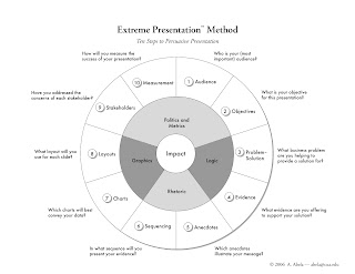
The first is Extreme Presentation Method a methodology by Dr. Andrew Alba at Catholic University.
"The Extreme Presentation method is a step-by-step approach for designing presentations of complex or controversial information in ways that drive people to action. It is based on extensive empirical research and has been pilot tested among leading corporations, including Microsoft, Exxon-Mobil, Kimberly-Clark, eBay, and Motorola."
 This site is a great resource. It will walk you through all the major elements you need to consider when putting together a presentation. And the advice is really good. Look at his explanation of Ballroom Presentations for Conference Room Presentations:
A presentation idiom is a form of expression with an associated set of design principles. I call the two main types of presentation idiom Ballroom style and Conference Room style. Ballroom style presentations are what most typical PowerPoint presentations are trying to be: colorful, vibrant, attention-grabbing, and (sometimes) noisy. They typically take place in a large, dark room—such as a hotel ballroom. Conference room style presentations are more understated: they have less color, with more details on each page; they are more likely to be on printed handouts than projected slides, and they are more suited to your average corporate conference room.
The biggest single mistake that presenters make—and the root cause of the PowerPoint debate—is confusing the two idioms, and particularly, using ballroom style where conference room style is more appropriate. Almost all PowerPoint presentations are given using ballroom style—yet most of the time presentation conditions call for conference room style. Ballroom style is appropriate for where the objective is to inform, impress, and/or entertain a large audience and where the information flow is largely expected to be one-way (presenter to audience). Conference room style presentations are more suited to meetings where the objective is to engage, persuade, come to some conclusion, and drive action. This covers any presentation where you want your audience to do something differently as a result of your presentation. It includes: making recommendations; selling; training; communicating the implications of research; and raising funds. Information flow in this idiom is expected to be two-way—it’s more interactive.
Pictures Tell A Thousand Words
Eliminate the 11 point font pages with paragraphs of text. There is a better way. The other presentation to look at is by Seth Godin, marketing guru. If you don't know Seth Godin you have to check out his blog.
Seth has a book out called Tribes which is a good quick read. He posted a presentation that he did about the book to slideshare and I have posted it below. This is one way of doing a presentation. It uses images to tell the story. Remember? A picture tells a thousand words? Well, I assure you that if you can do even a little of this in your presentation, people will remember it.
Seth Godin on TribesView more presentations from sethgodin.
Borrow and Steal
And lastly, I recommend the site Slideshare. There are thousands of presentations posted by users all over the world. What better way to develop a good presentation than to look at a few dozen to see what works for you, what catches your eye, what doesn't work. You will pick up at least five good ideas by spending 15 minutes on this site.

No comments:
Post a Comment